


HESTA needed its member portal to be much more than just a platform for its users. Defining brand values and discovering member objectives, an online portal was designed to ensure every member experienced the warm, human and personal touch that is quintessentially HESTA.
As the Lead UI designer working with a UX design team, we created three content types that each had a specific design direction, this ensured members knew exactly where they were in the experience.
Action pages highlighted in purple encourage a member to take positive steps to grow their balance. Long forms are broken up over multiple stages which helps members to navigate through a task easily, one step at a time, ensuring they are never overwhelmed.
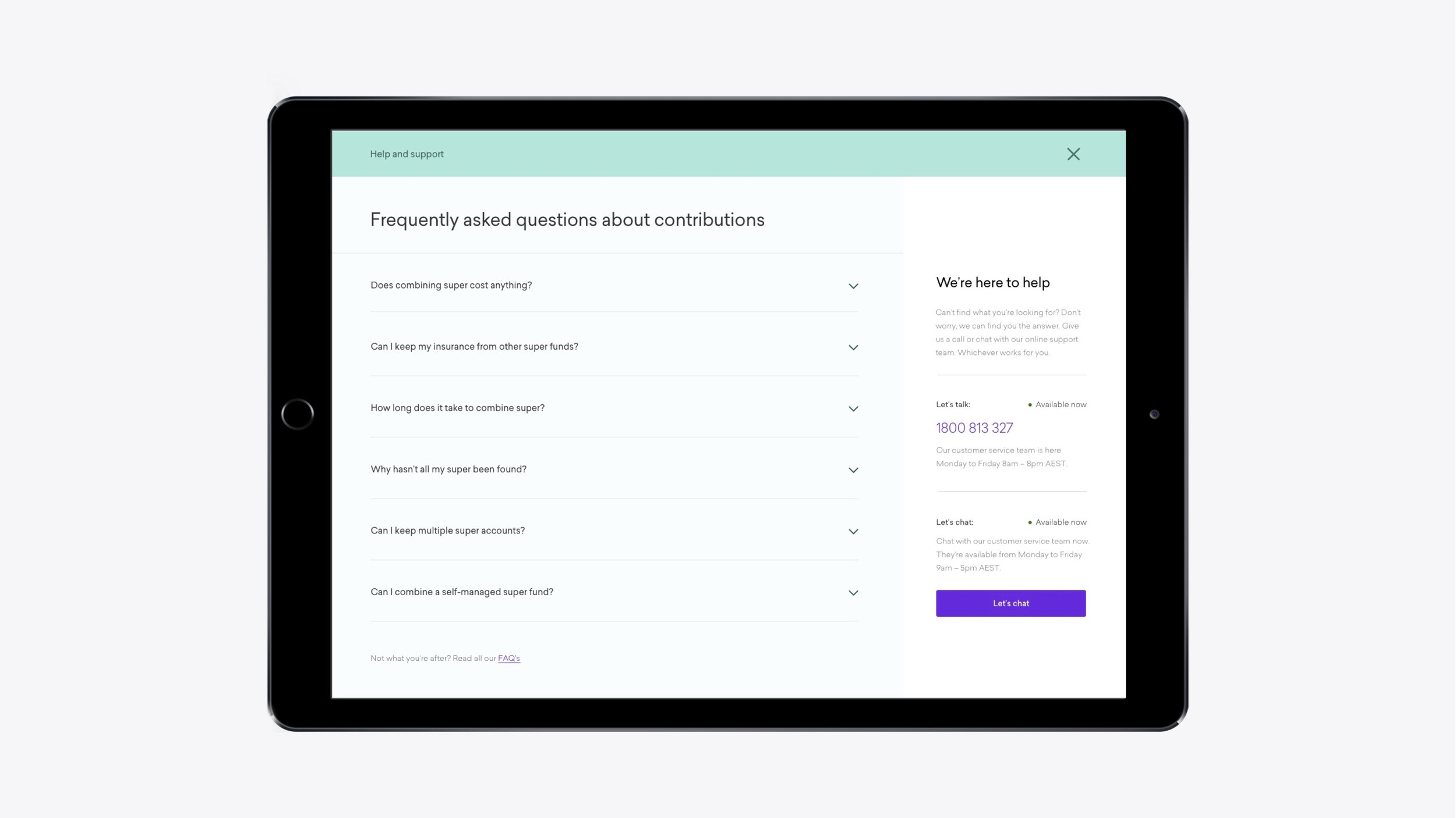
HESTA prides itself on ensuring members have a helping hand wherever they need. Our green became our symbol for help, providing the place for assistance was always in the same consistent space (bottom right) across the platform. Ensuring information is easy to find gives members effortless access to the necessary information, which empowers and enhances their financial literacy.
Lastly, utility pages are dedicated to administration and our members' personal information. The light grey, less bold colour palette enables users to recognise they are in a different area of the platform which focuses on their account.
Skills, outputs, and deliverables:
- Competitor analysis review
- Design direction
- UI design
- User testing
- Interactive prototypes
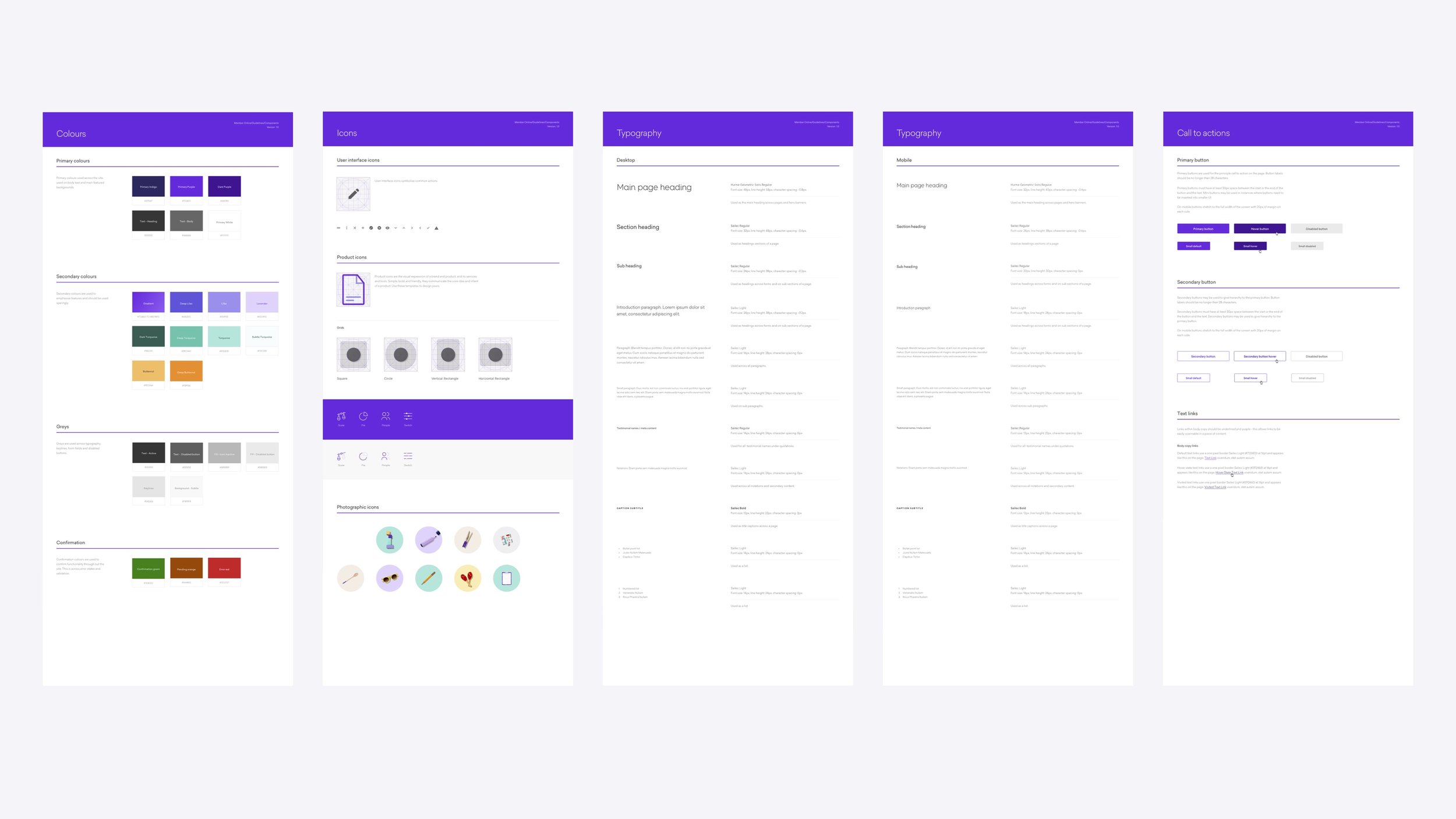
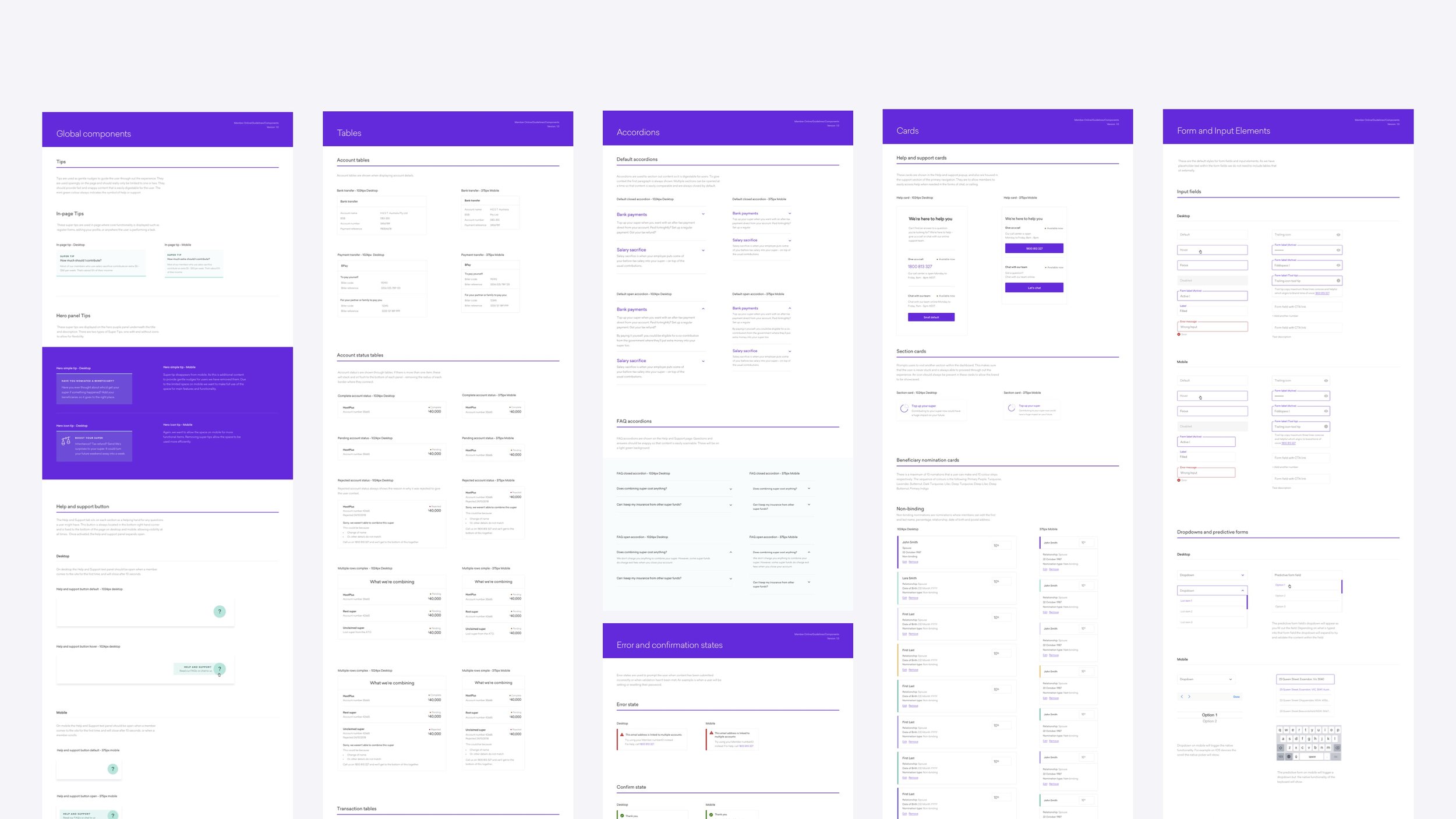
- Creating and maintaining the design system
- Working closely and collaborating with developers
- Stakeholder management
- Design reviews of the build using Jira and Confluence